Viewing Multiple Interactive Plots with plotly And trelliscopejs

Jeremy Selva

Introduction to Lipids

Lipids are organic compounds that are mostly insoluble in polar solvents like water.

The most common ones are cholesterol and triglycerides in blood lipid panel test.

First figure on the top left is a picture of a trained medical professional drawing blood samples from a person's arm symbolising a blood lipid panel test.

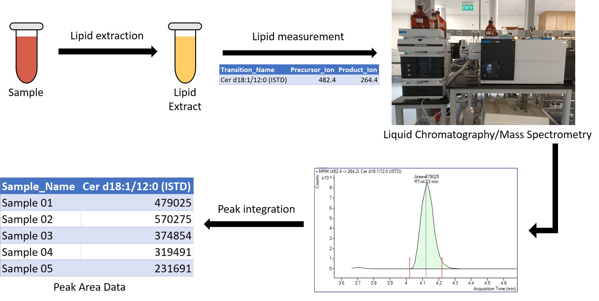
How Lipids are measured (Targeted Lipidomics)

Figure showing the workflow of how lipids are measured in a targeted lipidomics settings. Samples are first converted to lipid extracts. From a given list of transitions to measure, lipids in the extracts are measured using liquid chromatography and mass spectrometry. In the example, a transition from an internal standard Ceramide d eighteen one twelve zero is measured. This results in chromatogram peaks which the user needs to integrate the area under curve. In the case of the internal standard Ceramide d 18 1 12 0, it is four hundred and seventy nine thousand and twenty five. After the peaks are integrated for all samples and transtions, the peak area data are exported for further processing.

Quality Control (QC) Samples

Quality control samples helps to check the severity of variation from external sources such as contaminant ions.

We want to keep molecules that gives a low variation on the quality control samples.

Plots are exported as pages in a pdf file.


Figure showing an injection sequence of internal standard Ceramide d eighteen one twelve zero as a bar chart. The y axis is peak area while the x axis is the injection sequence. The different colours on the bar chart repsresent the different QC sample type. The important ones are the ones in blue representing the BQC. The coefficient of variation of the BQC is around 0.085 which is a low value. Hence, the internal standard Ceramide d eighteen one twelve zero has a low interference from unwanted sources. This injection sequence bar chart is exported as a pdf file.

Motivation for using plotly and trelliscopejs

Today’s targeted lipidomics workflow can measure up to a few hundred molecules.

This gives a pdf file of over 500 pages.

Looking at these static plot individually to gain insights is tedious.


Figure showing an injection sequence

Motivation for using plotly and trelliscopejs

Out of > 500 molecules,

  • Can I have more info about the outlying samples in the red box ?
  • How many Ceramides have BQC CV over 20% ?
  • Can you plot the same data as a Raincloud Plot ?

Figure showing an injection sequence

Motivation for using plotly and trelliscopejs

Using plotly to create interactive plots is moving in the right direction.

However, distribution of such results to collaborators/managers remains a challenge.

Interactive plots cannot be stored in pdf files.

Shiny was considered but

  • Lack expertises to maintain a secure web server to run Shiny applications.

  • Cannot expect collaborators/managers to install/run R packages and code to rebuild the Shiny application just to view the results.

Figure showing the a workflow using plotly and trelliscopejs. plotly and trelliscopejs, represented by ther logos, are used to create a folder called Dilution Plot Folder. The Dilution Plot Folder contains a appfile folder, a lib folder and a html file call index. The folder is then compressed into a zip folder called Dilution Plot Folder.

Quarto Example

Thanks to open science, I am able to create a walk through example using Quarto .

Left figure showing a Nature Communications paper by Wolrab et. al. published on 10 January 2022. The paper is titled Lipidomics profiling of human serum enables detection of pancreatic cancer. This is followed by highlighted text showing where to download the data set used for the paper. They can be found in sections Data Availabilty: RP-UHPLC/MS Phase 2 and Supplementary Information: Supplementary Data 1 to 20. Right figure shows the use of the published data set to create a Quarto interactive document with the use of plotly and trelliscopejs.

Column Of Plots

Use dplyr::mutate and trelliscopejs::pmap_plot to save plotly plots as a new column.

Figure showing how to create a new column containing a column of plots. dplyr mutate is used to create the new column called dilution panel. trelliscopejs pmap_plot is used to create the individual dilution plots in plotly.\n To print the dilution plot of the first row, type the command dilution_plot_table$dilution_panel[[1]]. The dilution plot results can be seen on the rightmost figure.

trelliscopejs cognostics

Providing metadata information as trelliscopejs cognostics can help to improve the user experience.

Refer to the Quarto example on how to do it.

Left figure shows how to find the list of cognostics in a result generated by trelliscopejs. Just click on the information button beside the trellis plot title. In the example, the title is Injection_Sequence_Plot. Following left bottom figure shows a filter panel with the cognostic information of the product ion button. The cognostics is displayed as 'ions created from fragmentation of the precursor ions' when the mouse if hover on the product ion button. Right figure shows a Quarto document telling users how to create trelliscopejs cognostics from metadata information.

Results Distribution

To export a trelliscopejs object.

Figure showing three steps on how to export a trelliscopejs object. First, set the working directory to be your project folder. Next, call the script that generates the trelliscopejs object on the R console. Do note that before calling the script on the R console, users must give the name of the output folder to the path parameters as well as set self_contained to false in the trelliscope function. A correct execution will results in a desired folder being created. The folder should contain two folders called appfiles and lib respectively and a html file called index. Double clicking on the html file should open the trelliscopejs results. The last step is to compress the whole output folder as a zip file.

Results Distribution

To export a Quarto document with trelliscopejs object.

Figure showing three steps on how to export a Quarto document containing trelliscopejs objects. First, set the working directory to be your project folder. Next, click on the Render button to render the Quarto script. Before rendering the script, users must give the name of the output folder to the path parameters as well as set self_contained to false in the trelliscope function. In addition, self-contained must be set to false on the Quarto YAML header at the top of the Quarto script. The trelliscope function should output a folder named after what user put in the path parameters. The Quarto knitr engine should generate relevant folders such as a folder titled images, a folder titled name of Quarto script_files and a html file titled name of Quarto script_file.html being created. The last step is to compress all these output files and folders as a zip file.

Results Distribution

Exported examples are found under the Releases section in the below GitHub page.


Figure showing a GitHub page highlighting where the Releases section is. Double clicking on the Releases section will bring users to the exported examples which can be downloaded as zip files.

Other Resources

trelliscopejs Examples

Presentation

Hope to see more examples…

Conclusion

Summary

  • Quality control samples are useful to check for unwanted variation in a targeted lipidomics workflow.

  • plotly and trelliscopejs can help to explore many interactive plots in an effective way.

  • Hope that the Quarto example and advice provided are useful.

Figure showing two workers praising the presenter for providing a good visualisation report.